Avid Climbing Gym Website
Unmistakably, the Avid Climbing Gym captured the community's hearts when it swung open its doors in 2008, and the first people began to warm up to climb.
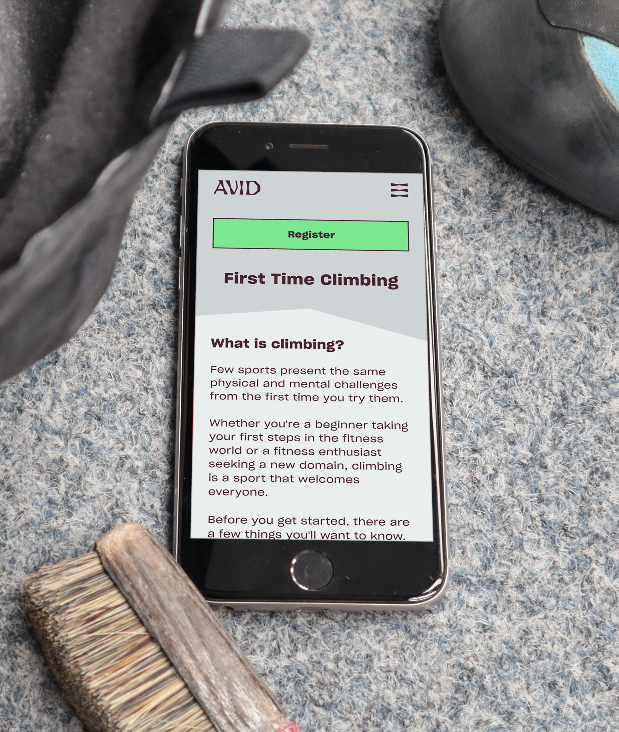
Quickly outgrowing and receiving not-so-positive feedback on their first website, I jumped at the chance to revamp Avid’s online presence. I established the project parameters through conversations with the Avid team, and the project got off the ground, gilded by UX Design principles.
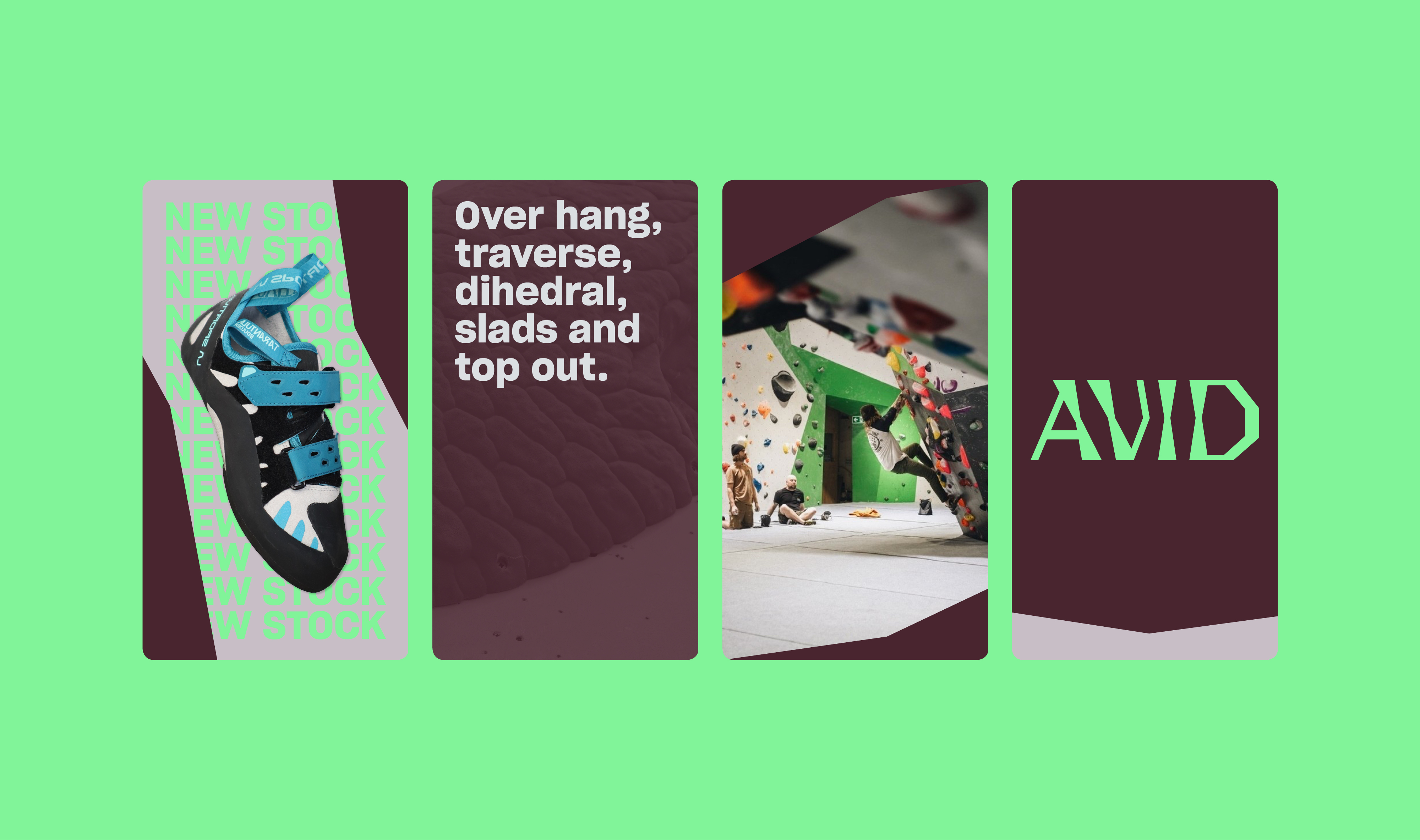
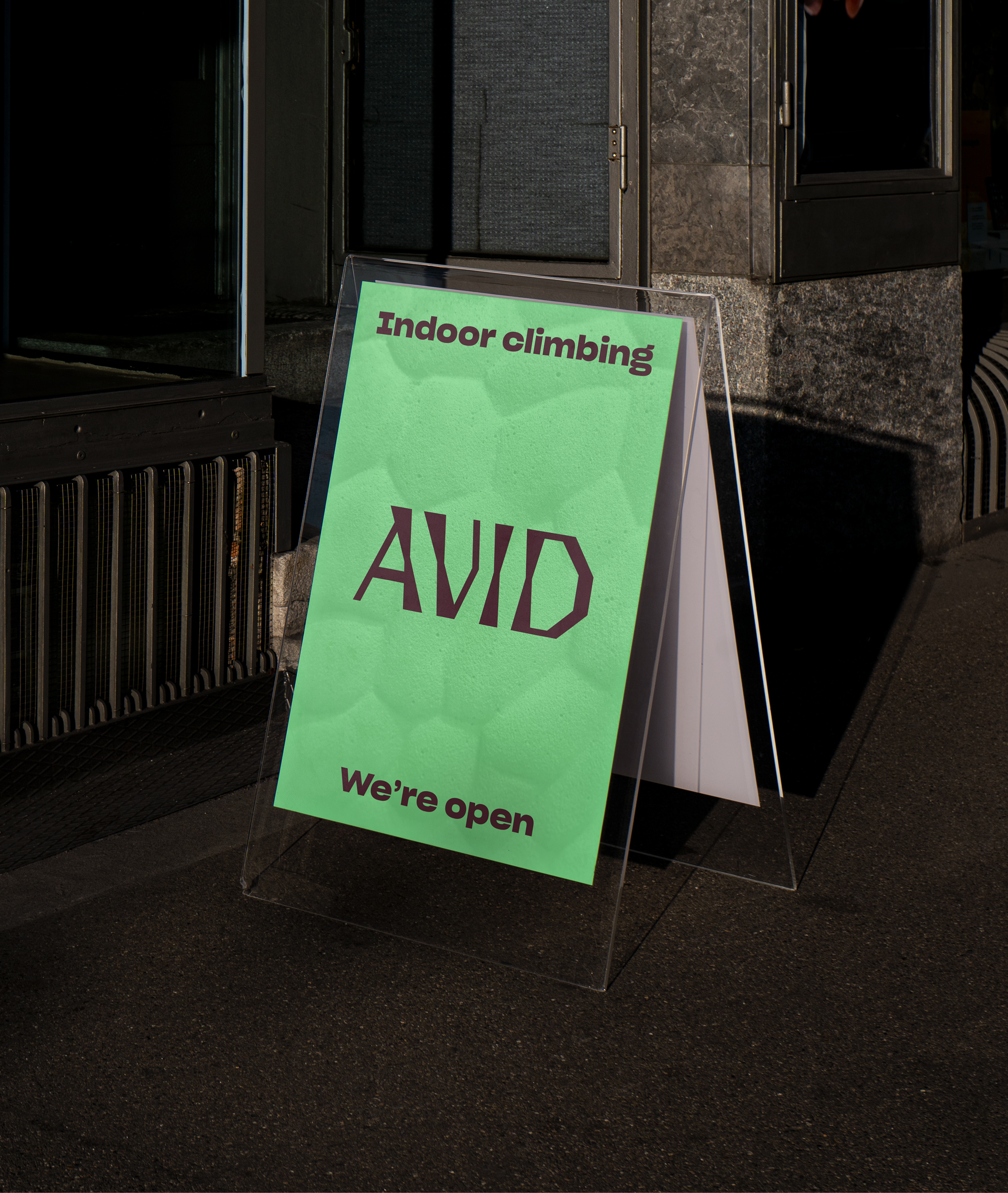
The visual language was born, directly inspired by Avid’s climbing wall contours. The design language encapsulates Avid’s brand, from the climbing walls to digital and physical materials, unifying the whole visiting experience to reach that final solution.


